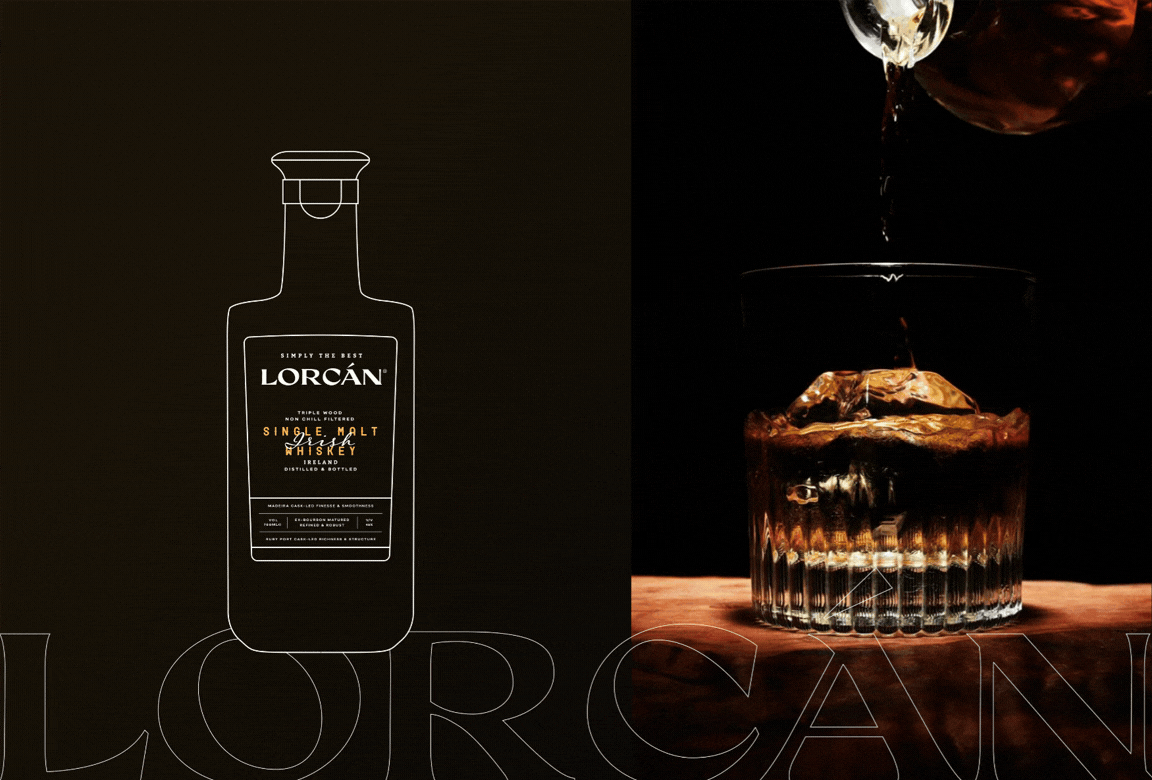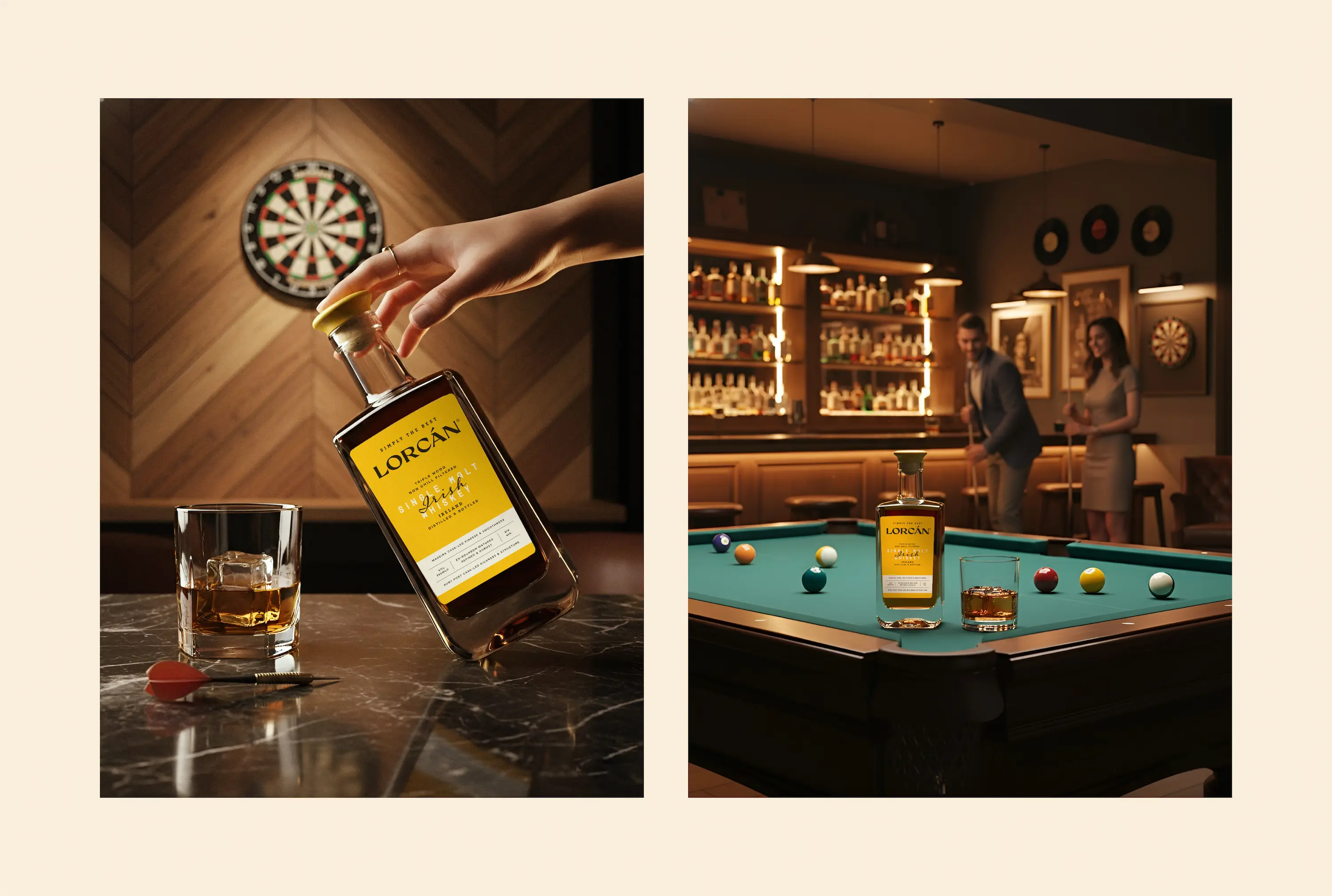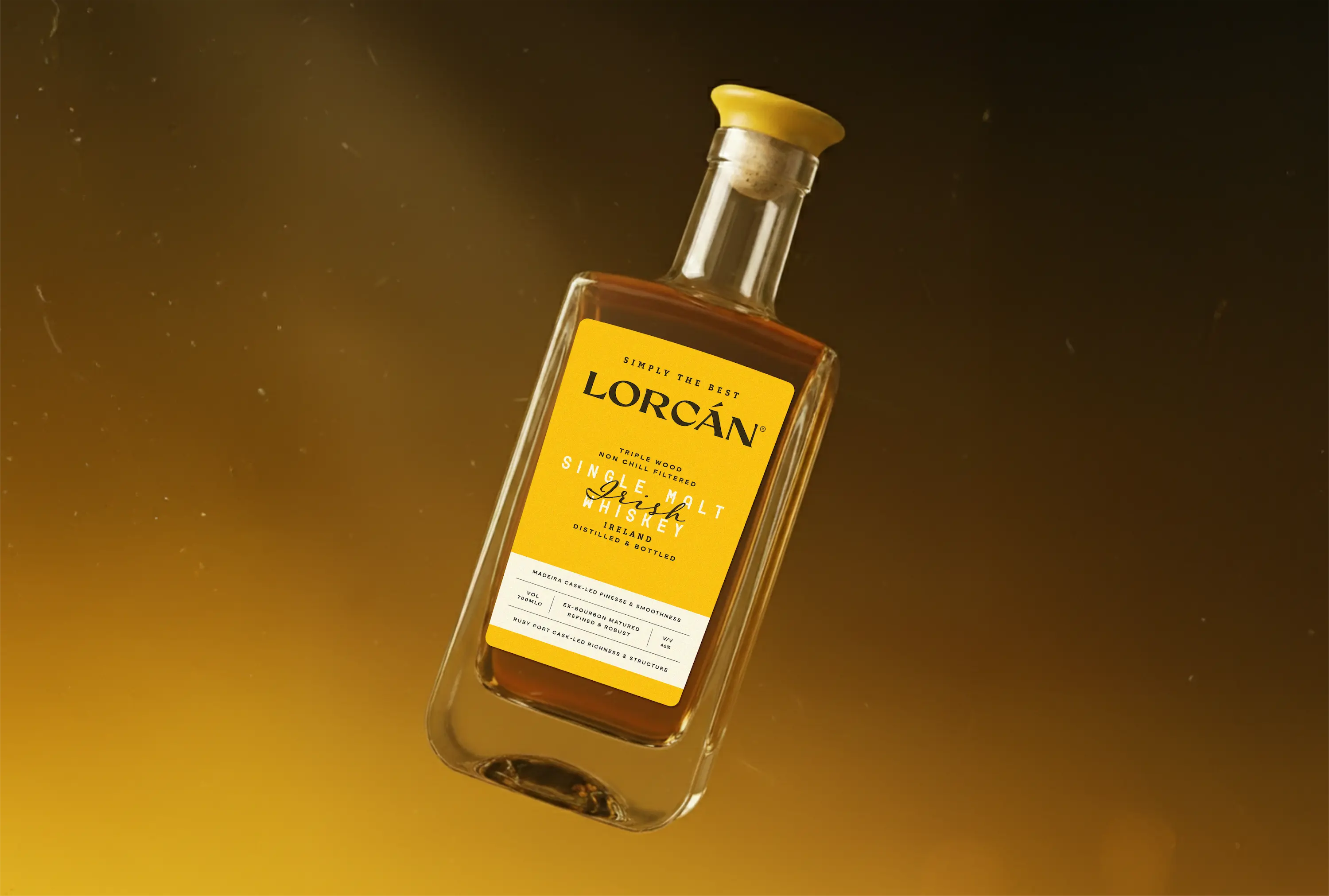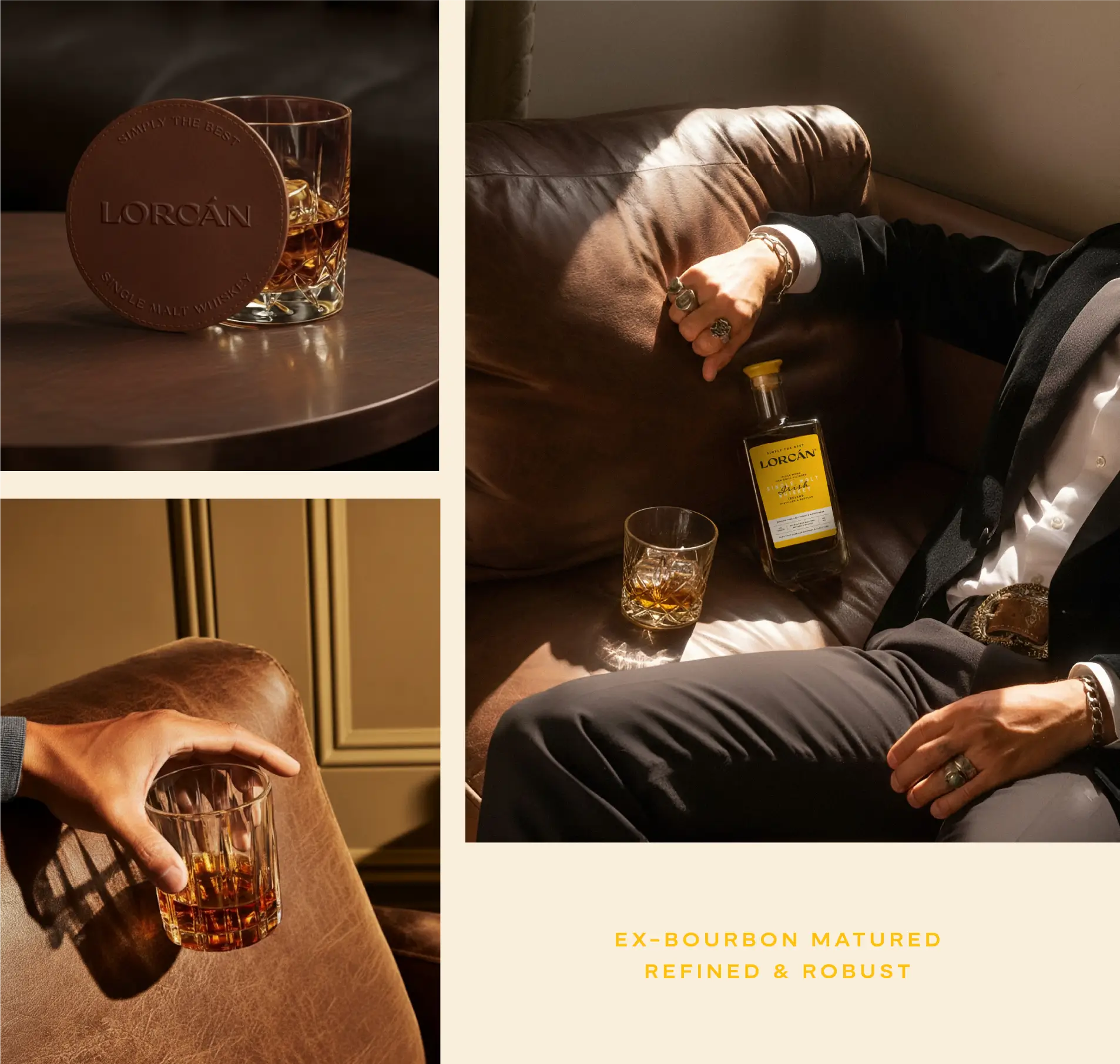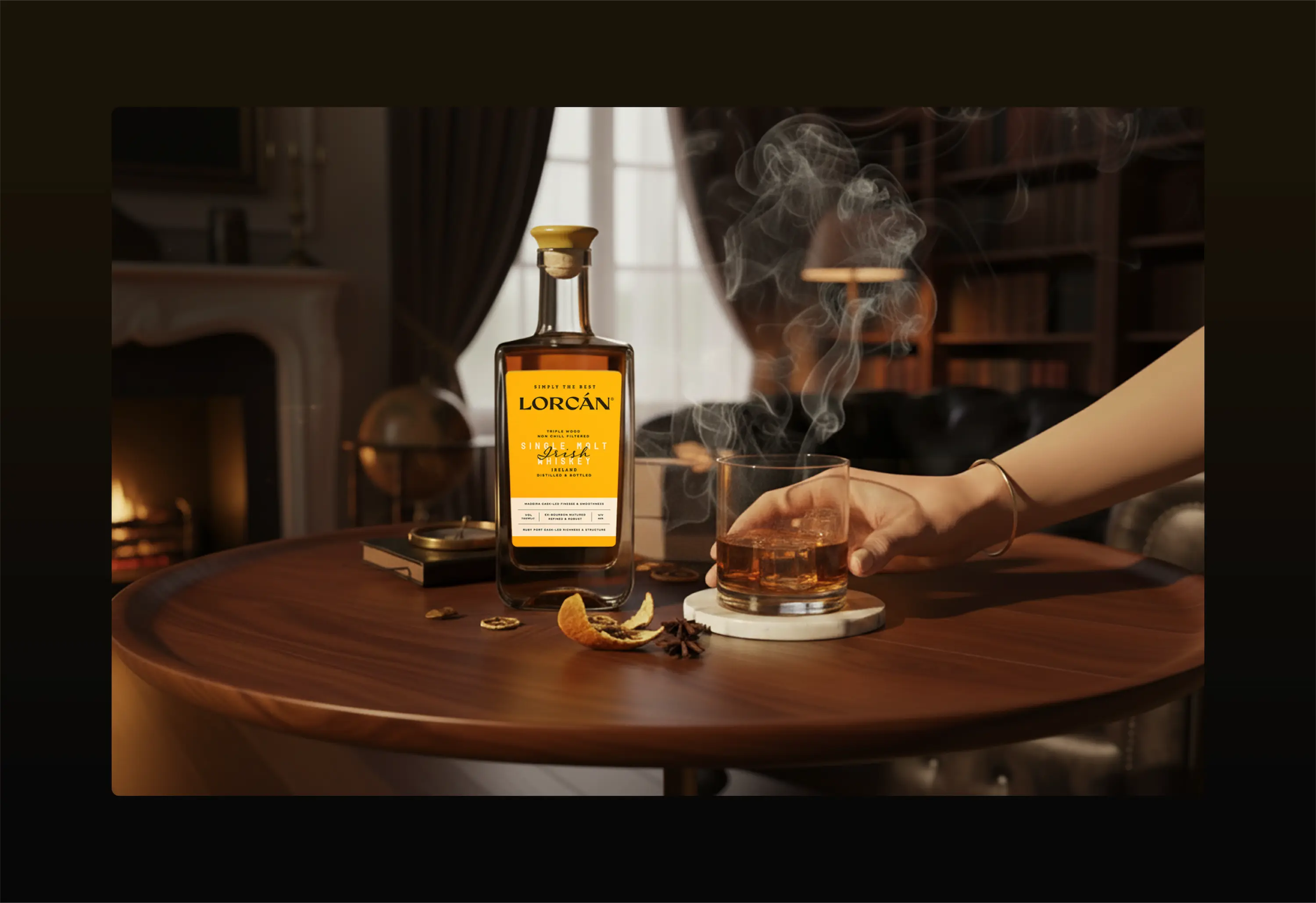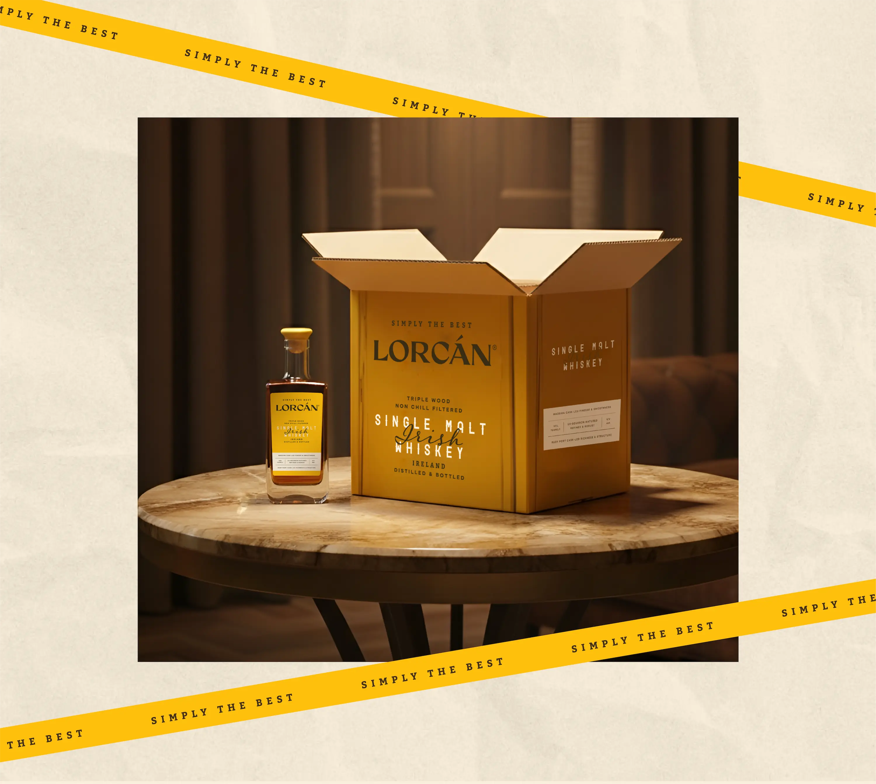
Lorcan is a contemporary whiskey built around a simple premise:character doesn't require spectacle. The bottle is shared, a structure commonacross the range, yet Lorcan is immediately its own. Identity is formed notthrough form, but through design decisions: tone, hierarchy, texture, the weightof a typeface, the silence between elements.
+ more information
- less information
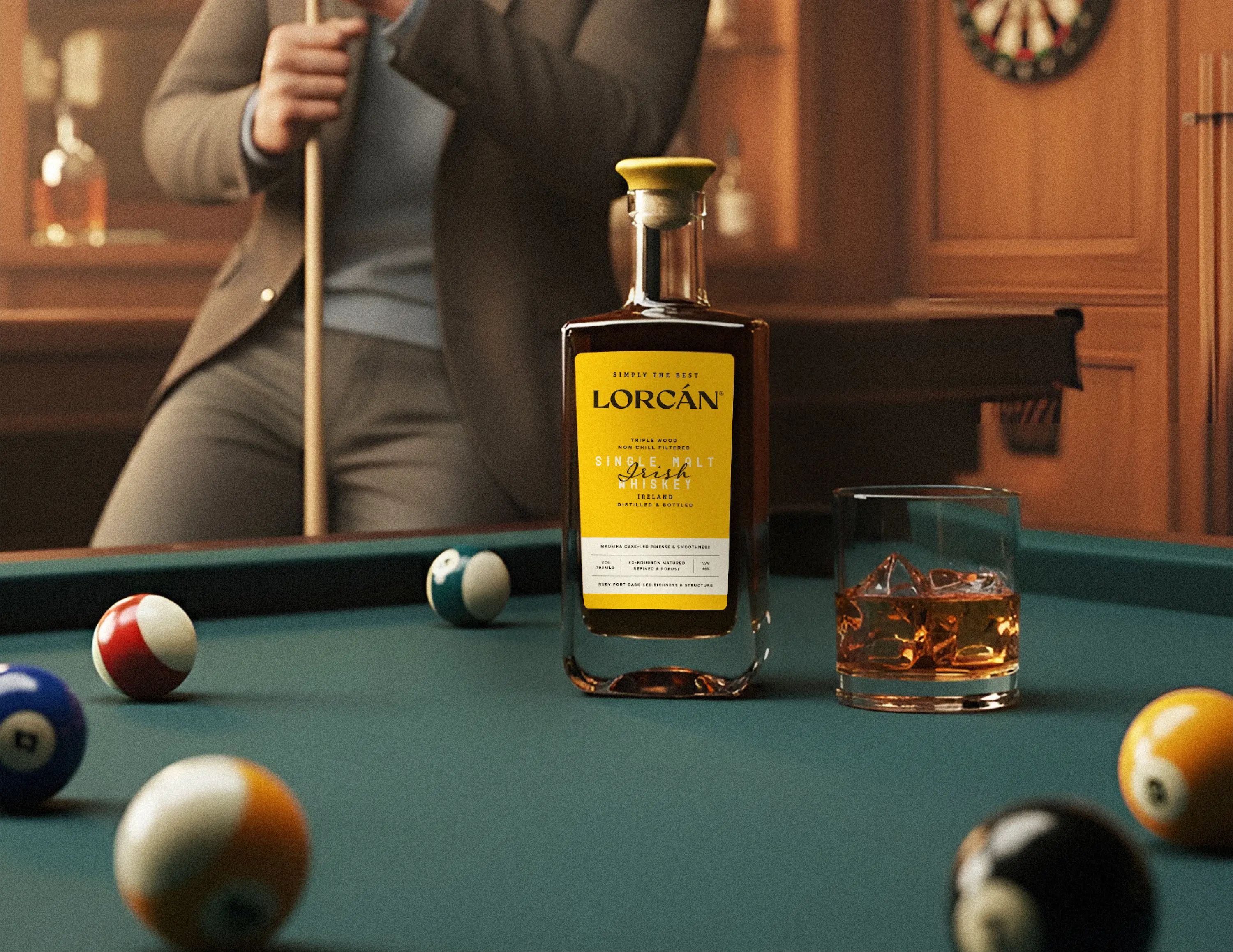
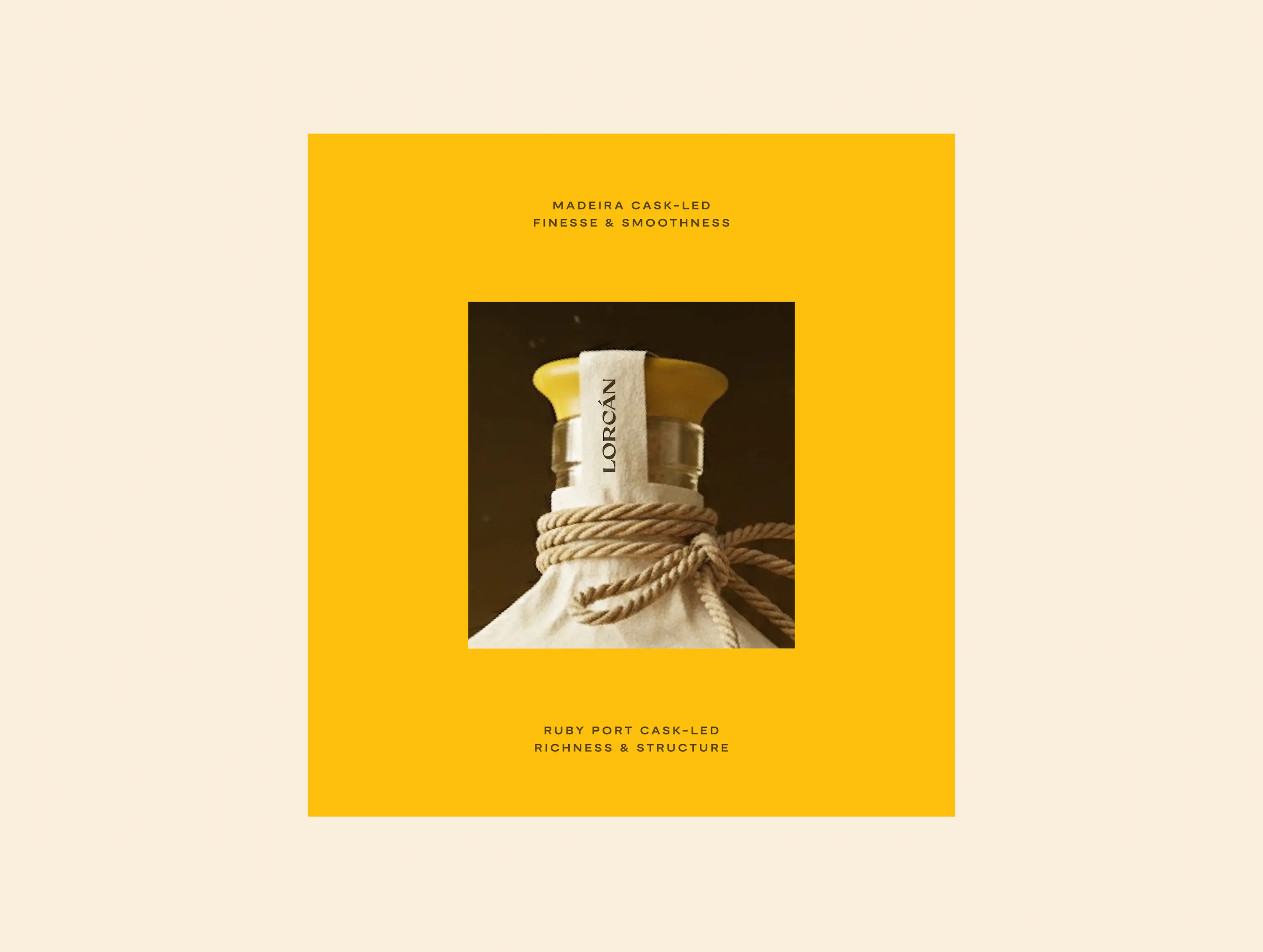
The visual language is one of restraint. Every choice is load-bearing. Thelabel architecture, typographic system, and finish work in concert toproduce something that feels considered rather than decorated presentrather than performative.
Where other whiskeys reach for heritage symbols and categoryshorthand, Lorcan finds its confidence elsewhere: in structure, incomposition, in the quiet authority of things made deliberately.
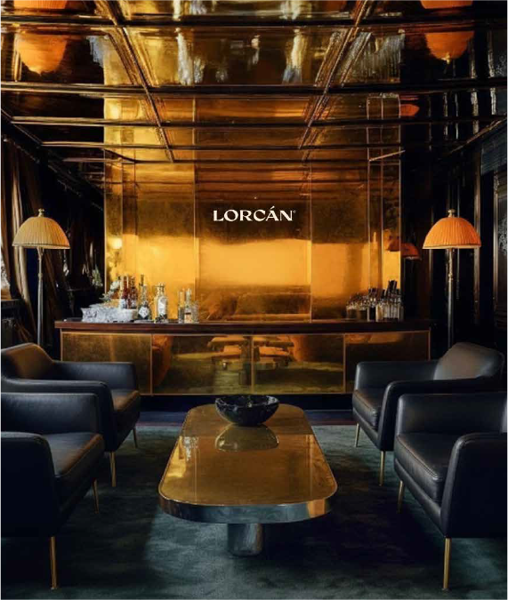
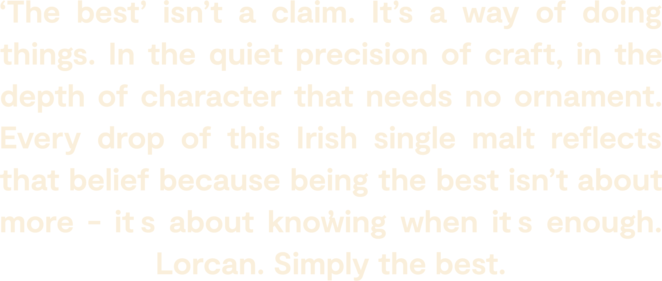
The result is a brand with depth rather than noise. A system that scaleswithout compromise. A whiskey identity that doesn't need to announceitself because the work speaks plainly, and that's enough.
PROJECT TYPE
Brand Identity & Packaging
CLIENT NAME
Incredible Spirits Ind Pvt Ltd
SOCIAL MEDIA
NA
PROJECT SCOPE
Brand Nameing
Packaging Design
Brand Identity
TIMELINE
2 Months
YEAR
2025
AUTHORS
Khushika Pahwa
Harshil Shah
Abhay Shevkar
BRAND DIRECTOR
CREATIVE DIRECTOR
GRAPHIC DESIGNER